
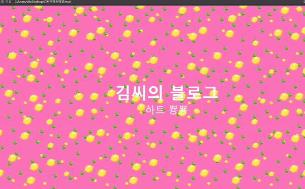
위에 결과물과 같은 웹 프론트 상에서 움직이는 배경을 구현해보겠습니다.
이번 글을 통해 배워갈 내용
- 자바스크립트 없이 HTML, CSS 만을 가지고 움직이는 배경을 만들어 보겠습니다.
HTML은 다음과 같이 작성하였습니다.
<!DOCTYPE html>
<html>
<head>
<link rel="stylesheet" href="style.css">
<title>Page Title</title>
</head>
<body>

<div class="my_text">
<h1>김씨의 블로그</h1>
<p>하트 뿅뿅</p>
</div>

</body>
</html>

<!-- 김씨의 코드 -->
CSS 는 다음과 같이 작성하였습니다
* {
  margin: 0;
  padding: 0;
}

/*Keyframes*/
@keyframes rain_effect {
0% {background-position: 0px 0px, 0px 0px, 0px 0px;}
50% {background-position: 400px 800px, 300px 300px, 200px 200px; background-color: #FF69B4}
100% {background-position: 0px 0px, 0px 0px, 0px 0px; background-color: #F8C8DC}
}

@-moz-keyframes rain_effect {
0% {background-position: 0px 0px, 0px 0px, 0px 0px;}
50% {background-position: 400px 800px, 300px 300px, 200px 200px; background-color: #FF69B4}
100% {background-position: 0px 0px, 0px 0px, 0px 0px; background-color: #F8C8DC}
}

@-webkit-keyframes rain_effect {
0% {background-position: 0px 0px, 0px 0px, 0px 0px;}
50% {background-position: 400px 800px, 300px 300px, 200px 200px; background-color: #FF69B4}
100% {background-position: 0px 0px, 0px 0px, 0px 0px; background-color: #F8C8DC}
}

@-ms-keyframes rain_effect {
0% {background-position: 0px 0px, 0px 0px, 0px 0px;}
50% {background-position: 400px 800px, 300px 300px, 200px 200px; background-color: #FF69B4}
100% {background-position: 0px 0px, 0px 0px, 0px 0px; background-color: #F8C8DC}
}


body {
	background-color: #F8C8DC;
	background-image: url('lemon_big.png'), url('leaf.png'), url('lemon_small.png');
	animation: rain_effect 40s linear infinite;
	-webkit-animation: rain_effect 40s linear infinite;
	-moz-animation: rain_effect 40s linear infinite;
	-ms-animation: rain_effect 40s linear infinite;
}

.my_text {
    display: flex;
    flex-direction: column;
    align-items: center;
    height: 100vh;
    justify-content: center;
    color: #fff;
}

.my_text h1{
	font-size: 5em;
}

.my_text p{
	font-size: 3em;
}

/* Kim C 코드 */
자바스크립트 없이 CSS의 Key frame을 활용해서 움직이는 배경을 만들었고
body 태그 자체에 넣음으로서 배경이 움직이게 되고
배경 색상은 두 핑크 색상 간에 바뀌게 만들었습니다.
.my_text 라는 클래스를 만들어서 텍스트를 중앙정렬 하였고
텍스트 크기는 기존 h1 과 p1위에 새로운 값을 입력해서 사용하였습니다.
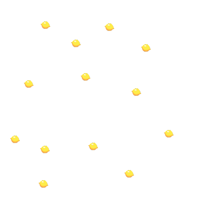
이미지는 아래와 같이 픽사베이 이미지를 사용해 직접 만들었으며 PNG 파일로 만들었습니다.
(픽사베이 이미지 위치)


참조 및 인용
https://developer.mozilla.org/en-US/docs/Web/CSS/background-position
https://developer.mozilla.org/en-US/docs/Web/CSS/appearance
728x90
'Javascript > 웹 기타' 카테고리의 다른 글
| Azure Functions 로컬에 구현해보기와 3가지 꿀팁 (0) | 2022.05.04 |
|---|---|
| Javascript 없이 CSS,SVG로 멋진 Loading bar 효과 구현해보기 (0) | 2022.04.10 |
| Javascript 없이 CSS,SVG로 멋진 Ripple 효과 구현해보기 (0) | 2022.04.10 |
| CSS에서 패딩 속성이 너비 또는 높이를 변하게 하지 못하게 하는 한가지 방법 (0) | 2022.03.13 |
| VS 코드에서 HTML 템플릿 생성 단축키 (1) | 2021.07.10 |